
Last year, PaintCare celebrated the tenth anniversary of Oregon’s first-in-the-nation paint stewardship law, which paved the way for a statewide paint recycling program that would soon be followed by PaintCare programs in other U.S. states. We marked the milestone by showcasing some impressive achievements over the past decade and by looking ahead to our goals for the next ten years.
One of those goals was to closely consider the branding we use to represent PaintCare—the logo, typefaces, colors, and styles. We know that the organization’s brand and name have gained recognition with paint consumers over the last decade thanks to the results of our annual surveys that track the effectiveness of our outreach activities. However, we also saw a little room for improvement in this area.
To get a clearer picture of where we stood, we embarked on a brand perception study. We asked both our own staff and the general public about the performance, clarity, and effectiveness of PaintCare’s brand elements. We especially wanted to know if people who are new to PaintCare understand that we operate recycling programs for leftover paint and whether our branding effectively expressed our role as an industry-led stewardship program.
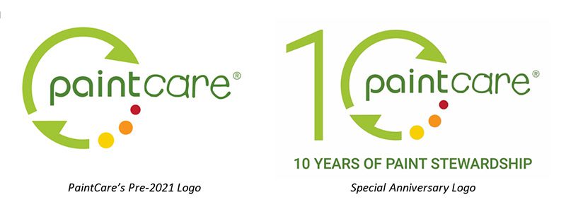
The responses we received demonstrated a broad range of feedback. On the whole, the data shows that while PaintCare’s brand is reasonably well-understood among stakeholders and the public, there is an opportunity to further develop the look and feel in order to make it more clear, memorable, and recognizable, and therefore more effective at supporting our public outreach objectives. Some important take-aways included the need for bolder colors, more legible fonts, more clearly understood graphic elements, and a way of clarifying PaintCare’s name to make the nature of our work more apparent.
Thom Feild, PaintCare’s in-house graphic designer, analyzed those findings and set to work developing PaintCare’s new official brand mark:
![]()
The new logo features PaintCare’s name in a new, bolder typeface, allowing it to stand out clearly while still expressing the accessible, approachable character of our organization and team. The main graphic element is a realistically depicted array of paint cans, connoting our mission of sustainably managing leftover paint products. The bright colors of the cans are an evolution from our previous logo, retaining a bright, friendly, and forward-looking feel. Finally, the tagline “Recycling made easy” has been added at the bottom to help clarify what we do (paint recycling) and how we help others (make sustainable management of leftover paint convenient).
Over the next year, PaintCare will extend this updated look to all of our digital and printed communications. The transition to PaintCare’s new brand will be managed as sustainably as possible. In line with our “Use It Up” values, partner drop-off sites in PaintCare states will begin receiving new versions of printed materials and signage only when supplies of older materials begin to run out and require replacement. As always, PaintCare will strive to use sustainable printing methods and source materials for its branded items whenever possible.
The change begins with our website, www.paintcare.org, which now showcases our new look as well as some additional improvements. Our site has been fully redesigned with the user in mind. Navigational menus have been made easier to use and clearer, and specialized target audiences (such as Painting Contractors, Retailers, Manufacturers, and Waste Facilities) can find detailed landing pages tailored for each with relevant paint stewardship information. The site’s responsive format allows all content to be clearly readable on any size viewing screen, an important consideration given that most of our visitors view www.paintcare.org on a mobile device. With the bolder contrasts afforded by the new brand, the site is now more accessible for all visitors.
As we roll out our new brand and website, PaintCare will continue seeking feedback from our partners, stakeholders, and the general public to ensure that our communications materials are as clear and effective as possible. Feel free to drop us a line and let us know how we’re doing!